ok, do i dig lee's post out of my spam filter, or not?
decisions, decisions, decisions... ;+)
***
lee said:
> On my system, my browser window is approx 1050 x 1600.
oh lordie.
you make your interface work for the average case, and who
reports back? the people who are _not_ average, that's who.
a 1050*1600 browser-window is a _portrait_ viewport...
are you really using a portrait monitor, lee, or are you just
being perverse by arranging your browser-window that way?
way back when i was a wee one, i worked for a professor who
was consulting for xerox, so i saw the alto and bravo machines
when they were still new, and i just assumed that we would all
be using portrait page-sized monitors like on those machines.
so imagine my disappointment when the landscape orientation
of spreadsheets spread its wrong-ass orientation on computing,
ensuring that we would wander in the desert for 30 years before
we'd be able to see a full-page of text on an affordable monitor.
and that would happen only because our still-landscape screens
had now grown gigantic enough that we could see _2_ full pages!
oh, along the way, i actually _tried_ using a portrait monitor.
got some software that switched the orientation on my g3,
so i could prop open the landscape clamshell laptop and
stand it on its side. it was great for word-processing and
desktop-publishing, but it was _lousy_ for web-browsing!
why? because most web-pages are designed for landscape!
eventually, as the web became more important, i relented...
so i think lee and his portrait browser-window might well be
having problems negotiating _any_ collaborative proofing site,
not to mention almost any site at all these days, if we're real...
but hey, who said reality had anything to do with this? :+)
so lee, my first piece of advice to you will be the opposite of
the advice i gave to jim -- namely, make your window wider!
and/or make the text smaller. either one (or both) will work.
if it's impossible to make your browser-window any wider
(i.e., your monitor is that size), or if the text is so small
already that you can barely read it, my advice is no good.
in that case, i would create another design for your case,
one that uses the vertical space rather than the horizontal,
meaning i'd _stack_ the three displays on top of each other,
such that you could see two out of the three at any one time.
the top one would be the .html, the middle one the page-scan,
and the bottom one the edit-field. (the user could reorder.)
any system has to let the end-user make adjustments to it...
like d.p. or fadedpage, i will probably have the user enter
the desired values into a preferences box, as that is an easy
way for a programmer to offer that functionality to users...
i've also put the values right on the working-screen itself,
rather than on a separate preferences screen, so i might do
that once again. probably nicest is to offer divider-bars,
which users can drag to change the way the screen is split.
(even nicer would be to store the info for the user, so once
they made the adjustment, it would stick as their preference;
but so far i've been loathe to store any type of information.)
anyway, thanks to jim and lee for bringing up the issues that
arise around the issue of screen-size (and screen orientation).
i was (and am) continually aware of them, thanks to being very
fortunate in having had a very big monitor for over 6 years, but
it's good to have it reinforced. especially with the netbooks and
the iphone/ipad, the range of screensizes is now overwhelming.
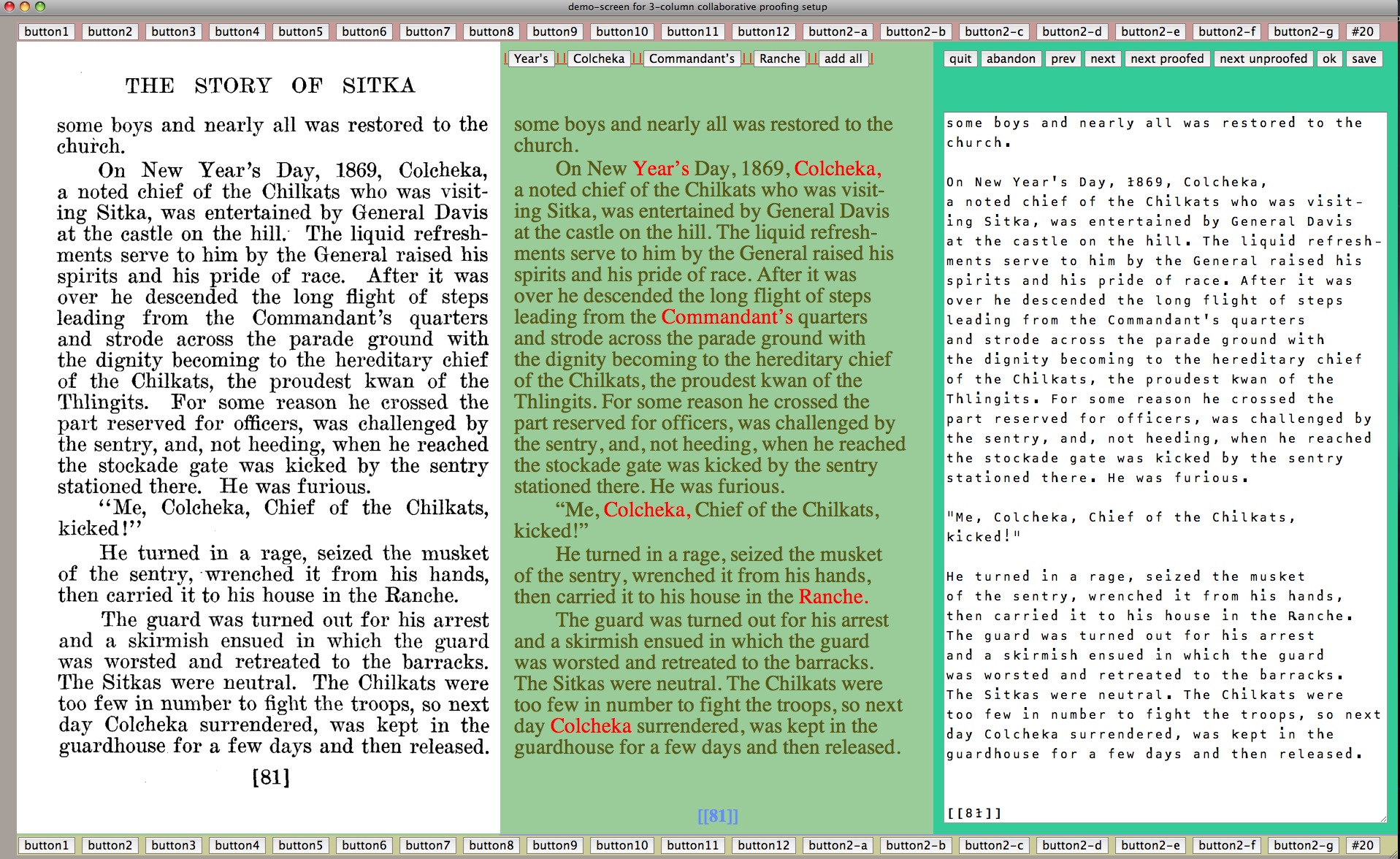
> the page image occupied a little more than
> two-thirds of the right-hand side of the screen
> and the apparent "smooth-reading" text occupied
> less than 1/3, resulting in a text reading screen that
> created line breaks in odd and unsettling locations
the aim is a 50/50 division, for a "facing-pages spread" look.
anything different than that is going to cause problems, yes...
> On the bottom half(?) of the page, the edit box
> (which, by the way, is much easier to read
> than the "smooth reading" presentation)
this tells us that lee does not have d.p.-monospace installed. :+)
> is set to an absolute width that
> does not cause the odd word wrapping
yes, it doesn't. it doesn't have _any_ word-wrapping, and
that's because i set the width of the edit-field to the width
of the longest line in the edit-field.
but, as we are about to find out, that is at times untenable.
> but which makes the two boxes have more width than
> the width of my browser, causing the edit box to
> appear below, and to the left of the page image.
yes, that does happen.
it happens _especially_ on the pages that had footnotes,
because those footnote lines have a very large _width_
(i.e., number of characters), as they were printed _small_.
so this experiment to size the edit-field according to its
_contents_ didn't work, not reliably, and i will abandon it.
(this is the _real_ error in the design. jim was focused on
the "unnecessary" _whitespace_, but that's just valuable
real-estate that can be used for another good purpose...
this interface flaw, though, is more serious. easy to fix,
as you decide to wrap the long lines in the edit-field or
else use a horizontal scrollbar. one of these two options
is largely unavoidable in some situations, as you know
if you look at any of the other proofing-site interfaces.)
> Believe me, I understand that getting a pleasing layout
> when you don't know and can't control the width of
> a user's browser is a difficult thing.
well, you _can_ know it, with a little javascript, but i have
chosen not to use any of that, to keep my internals simple.
and you _can_ control the width of the browser-window,
by simply setting it when you open it and stripping away
any resize potential; but it's not worth alienating the user.
what fadedpage has done (as far as i can tell) is to build
an interface that simply _demands_ a maximized window.
the design doesn't adjust if the window gets smaller, so
the user just can't see all of it. as good a solution as any.
interface isn't "hard". but it's not easy either. over at d.p.,
they have two interfaces (and they're working on a third),
and some people swear by one, and other people the other.
customization is key.
> there are two sets of radio buttons,
> one alternating between "b" and "c",
> and the other between "sho" and "no."
> I have no idea as to what these two
> sets of radio buttons accomplishes.
you could've tried them to find out. you know, curiosity.
(that thing that killed the cat.)
or i can just tell you...
the b/c set stands for "button" versus "color". this controls
the way that flagged words are displayed. the default is by
"color", meaning that the flagged words are rendered in red.
that makes them stand out, vividly, but it's all that that does.
if you choose "b" for "button" instead, you will see that the
flagged words are now rendered as _buttons_. clicking one
of these buttons adds that word to the custom-dictionary,
and the page is redrawn, showing the word now unflagged.
the buttons are an extremely convenient way to add a word
to the book's custom-dictionary. in fact, due to all the action,
and the sense of progress, it's fun! but if there are _lots_ of
flagged words on a page, adding 'em one-by-one is boring.
ergo, i added the "bulk-add" button. all the flagged words
are placed in the bulk-add field, and all words in that field
are put in the dictionary when you click the bulk-add button.
(so if any of those flagged words should _not_ be added, you
should delete them from the bulk-add field before clicking.)
> Above the edit box, but below the page image,
> there is an apparent edit box containing the
> hyphenated words "per- fect" and "cen- turies;"
> (but not the hyphenated word "moun- tain";
> to the side there is a button labeled "bulk-add."
> I do not understand what any of these controls are for.
the hyphenated fragments are not in the dictionary,
so they were flagged, so they are in the bulk-add field.
i'll eventually improve my spellchecking routine, such that
it will only flag hyphenated fragments if they're incorrect.
in the meantime, the "bulk-add" capability is quite good...
> It seems that the edit box is used to
> make corrections to the text as displayed above.
nope. it's only to add words to the custom-dictionary.
i'm a little surprised that this seems totally foreign to you,
because roger does something very similar on fadedpage.
(he lists the words, and makes users copy each one of 'em
into the bulk-add box, but other than that, it's the same.)
> Generally, I find little that is intuitive about the interface;
> however, this is not surprising, as I think there is
> very little in the world that is truly intuitive.
i wasn't aiming at "intuitive".
"easily-explained" is good enough.
> You might want to add some page title
> and explanatory comments to make it clear that
> the page consists of two parts
thanks, but no. once the system has been "easily-explained",
those elements just become unnecessary clutter to the user...
> In order to reduce "noise," you may want to have
> two separate pages, with a "switch mode" button to
> switch between "smooth reading" mode and the "edit" mode.
considered that. but decided to do it this way instead.
maybe once the interface-experimenters discover gold,
and have a nice ajax thingee that makes everyone happy,
i'll use that. in the meantime, i'll "keep it simple, stupid".
> I assume that for editing you would like people
> to use your proprietary s.m.l. markup language.
um, it's "z.m.l." the "z" stands for "zen", remember?
and "zero" and "zip" and "zilch" and "zoo" and "zzz".
and it's kind of silly to call it "proprietary", since
anyone can invent their own light-markup format,
including one that's just like z.m.l., and i will only
cheer them on from the sidelines, very raucously...
> It would probably be a good idea to add a button and
> associated popup window with a s.m.l. "cheat sheet."
i'll be doing something like that, yes...
> Hope this helps. Good luck.
aside from some unnecessary spin there at the end,
it was honest feedback, and i thank you for offering it.
it was definitely worth it to pull it from the spam folder.
-bowerbird


